During the summer of 2011, UMass Boston finished a $425,000 revamping of its website. Since Spring 2011, the website has changed, some for the better, but some for the worse.
Let’s start with the positive. The homepage of the website has an easy and understandable layout. The links clustered above the scrolling banner of UMass Boston-themed images are comprehensive. These images even connect you to “stories.” The idea of this scroll is to give prospective students a view of life at UMass Boston from the perspective of people already here.
While this is useful to prospective students, it has very little use for the ones already here. There is a right place and a wrong place to attract new students. Using the most prominent space on the homepage of the website for that purpose is insulting. Students who spend six hours a day on campus might like to know other things, such as “What is being served for lunch next Monday?” Is there a menu on the homepage? No.
Even as the homepage panders to prospective students, information for them gets buried and poorly explained. For example, the website cites “Room and Board” as $7,000 for undergraduates but $15,600 for graduates. Where do they get this number and why does it double? This is an $8,600 mystery.
Another problem: let’s say you disagree with this Opinions article and want to write a rebuttal. You like the new umb.edu website. To find the newspaper office, you type the name of the student newspaper (“The Mass Media”) into the search engine. What’s the first hit? “State of the University Address to the Campus Community.” Your search produced 523 results, spread over 53 pages. Maybe the one you want is buried somewhere on page 29. If you just type “newspaper,” you get nearly 60 results, in which The Mass Media comes tenth. Wouldn’t it be nice if, instead of devoting thousands of dollars to telling the story of the university, the money was spent on creating a better search engine so prospective students and current students alike could easily answer specific questions?
While significant money was spent on the website, other online materials geared to students have been ignored. The UMass Boston webmail crashes monthly, if not weekly. To check your email, you need to develop a password including numbers, capital letters, lowercase letters, and symbols. If you should forget this password, you need to reset it. To reset the password, you need to go through half a dozen steps, one of which requires you to know the password you forgot.
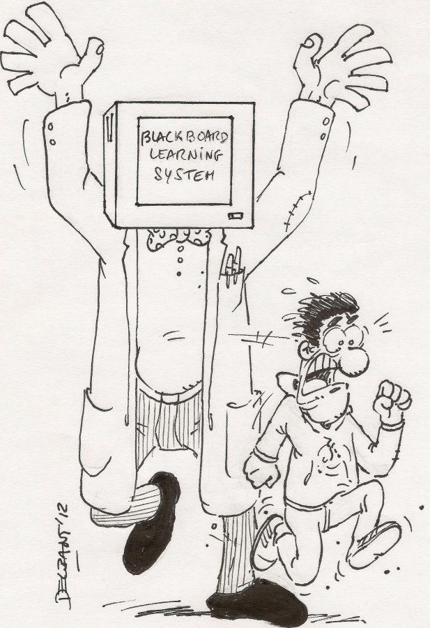
The Blackboard Learning System, a solid investment by the university, is equally flighty. While the technology is there, the cryptic maze of links usually leaves you refreshing a blank page where your assignment should be. Perhaps with some training Blackboard would be highly usable and useful. However, features like chatrooms (where you plug in a $20 pair of headphones to talk to classmates) results in one of two outcomes: (1) Everyone ends up talking over one another, because they can’t see one another — just try having a productive debate about Chaucer with 15 other people when you don’t know who is talking; or (2) You can’t find the online debate.
Blackboard is geared more to making the professors’ load easier than to helping students learn. A Blackboard-savvy professor will sometimes respond to your question about an assignment by saying, “See the Blackboard account.”
Worse yet, the Blackboard aspect of the class can be divorced from in-class time. A professor may hound you on Blackboard but say nothing to you in the actual class, never telling you that you forgot to turn in the assignment. Professors become Blackboard automatons.
Maybe the website is fine. Maybe pandering to new students is the right thing for the university to do. Maybe Blackboard can improve a class. Yet both the website and its associated systems leave much to be desired. Instead of achieving the ease-of-use and better learning experience intended, both often serve as roadblocks for current students. We deserve better than this.

