


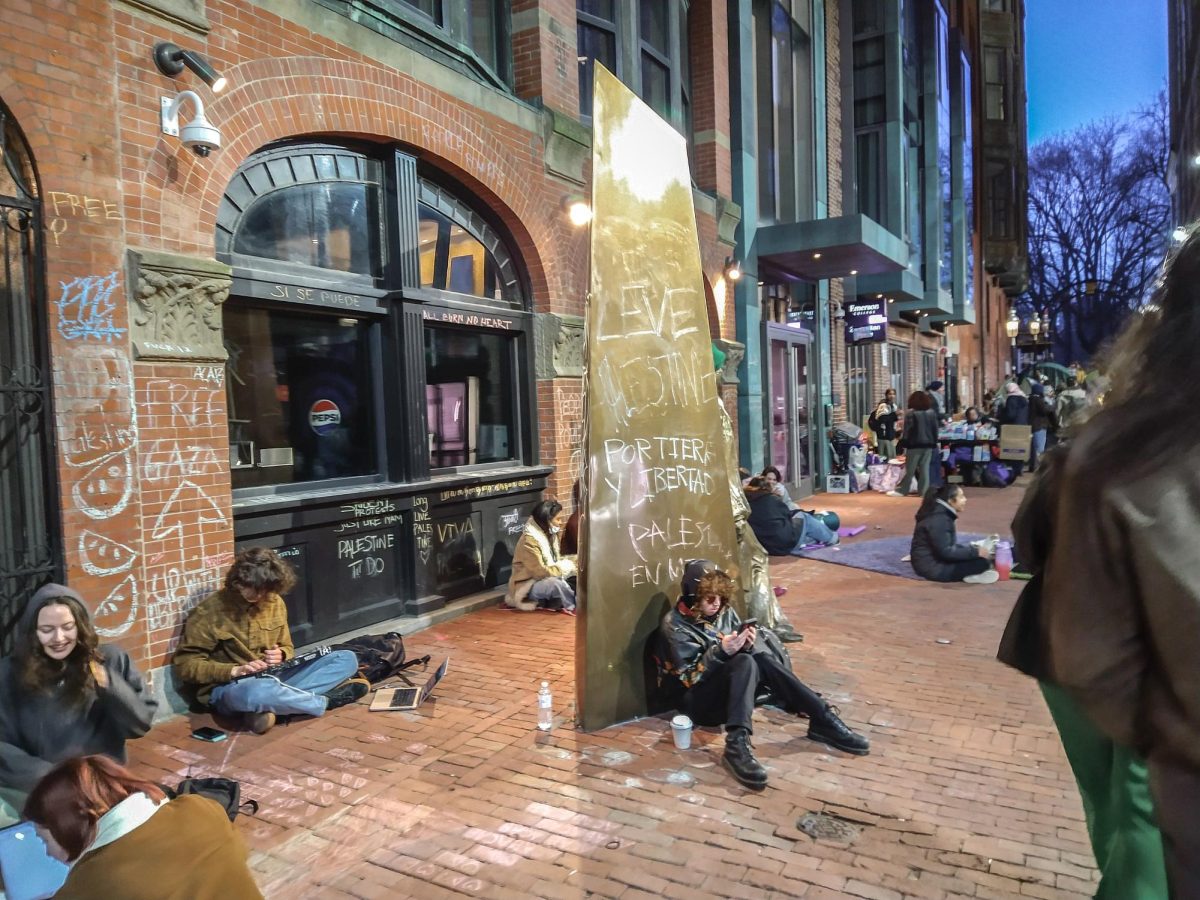


Abstract art is difficult to review, simply because different people take away different things from the same piece. One viewer may get one meaning from an image while another may get a completely different idea or feeling from it. From the standpoint of a reviewer and critic, abstract art is troubling due to its inherent difficulty to readily identify and describe the images and “qualify” whether or not the art is, in my sole opinion, good or bad. Because abstract art does not readily lend itself to the viewer the same way portraiture or landscape does, the viewer must connect with it on a different, more emotional level. Rather than understand the art, the viewer must instead understand their feelings of the art based on his or her interpretation. The current exhibit at UMass Boston’s Harbor Art Gallery, Color Pattern Structure, was organized by UMB drawing Professor Bartek Walicki. The show is an exhibition of abstract paintings by seven artists including Sam Duket, Carolina Duque, Rachel Hellman, Jason Lacroix, Marc Mitchell, Matt Murphy, and Walicki himself.
The work in the front room of the gallery features large scale paintings on canvases that stretch almost floor to ceiling, while the back room of the gallery, being more intimate, features smaller works. One piece that stood out to me is “Collateral” by Walicki. “Collateral” is a large 60-inch by 72-inch canvas featuring an image rendered in black, grey, and yellow of what appears (in my eyes) to be a distressed figure caught in the bombing of a city. The bombs look as though they were spray painted on with a stencil and the figures remind me of distorted versions of Munch’s “The Scream.” The image comes off a bit like Picasso’s “Guernica” except in Bartek’s piece we can see the bombs and bright flashes of light.
The work by Jason Lacroix consists of square canvases covered in a grid of circles using the primary colors red, yellow, and blue. The viewer instinctively wants to see a pattern in Lacroix’s work, yet while part of the works feature organized and patterned groups of color, other parts of the composition seem to break down and leave the eye grasping to structure it like the rest of the painting.
One other piece that caught my eye is “Grey Explosion,” also by Professor Walicki. “Grey Explosion,” located in the back of the gallery, is a 48-inch by 60-inch canvas that is literally an explosion of grey, with red, white, and some blue. There is no specific image in the canvas, as when I was looking at it I saw what appeared to be the outline of a dog amongst other animal-like shapes, while another person at the gallery at the same time saw a dinosaur.
While the exhibit does perhaps feature many artists and can be overwhelming at times, overall the exhibit is very strong. It features some of the largest paintings I have ever seen on display at the Harbor Art Gallery. Color Pattern Structure is on display at the Harbor Art Gallery (First Floor McCormack) from October 6th to October 31st.