


Compiled By: Bariş Mumyakmaz
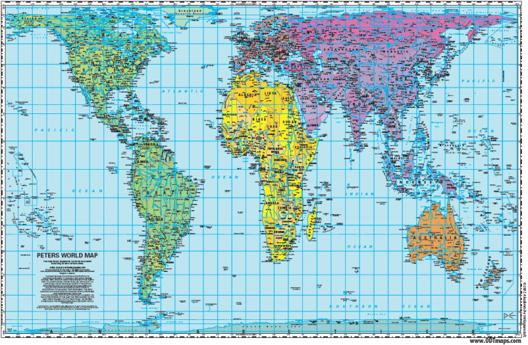
Have you ever thought there is something “strange” with world maps that you can’t explain? Even if your answer is “no”, reading this article may give you a different approach to see things in a different way.Keeping this spread page wide open, make a quick web image search to view “world maps”. Now compare all your search results with the spread image. Is there a difference? Or does it really not matter?Well, it matters for more than 5 billion people, who live outside the “western” world. And this article is meant to spread the word for a more “equal” world.The Peters Projection World Map is one of the most stimulating, and controversial, images of the world. Having sold more than 80 million copies in many languages, the Peters Map is already one of the icons for fairness and equal representation of world nations and third world.When this map was first introduced by historian and cartographer Dr. Arno Peters at a Press Conference in Germany in 1974 it generated a firestorm of debate.”The word ‘world history'” Peters speaks in a documentary film on his life, “is wrong in all our world history books.” Because he states that the world history is dominantly representing the Western Eur ope and the other parts of the world, especially Africa and South America are ignored.For Peters, the size is the first sign of the importance of a country. In Peters Projection Map, the sizes of the countries are exactly the same as in reality.One may think the size does not matter as long as the unfairness still rules our world. However, the size also affects the way we are looking at the world.”We don’t need a new map,” Arno Peters concludes. “We need a new view of the world. Is that the world we know? This is the world of Eurocentricism and this time is over.”Why does the world look different in maps?The earth is round. The challenge of any world map is to represent a round earth on a flat surface. There are literally thousands of map projections. Each has certain strengths and corresponding weaknesses. Choosing among them is an exercise in values clarification: you have to decide what’s important to you. That is generally determined by the way you intend to use the map.The most ‘common’ world map we know is cylindrical map projection created in 1569 by Mercator. Today the Mercator projection still remains useful for navigational purposes and is referred to by seafarers and airline pilots.The Mercator is also a “conformal” map projection. This means that it shows shapes pretty much the way they appear on the globe. The mapmaker’s dilemma is that you cannot show both shape and size accurately. If you want a true shape for the land masses you will necessarily sacrifice proportionality, i.e., the relative sizes will be distorted.The Mercator projection creates increasing distortions of size as you move away from the equator. As you get closer to the poles the distortion becomes severe. Cartographers refer to the inability to compare size on a Mercator projection as “the Greenland Problem.” Greenland appears to be the same size as Africa, yet Africa’s land mass is actually fourteen times larger.Because the Mercator distorts size so much at the poles it is common to crop Antarctica off the map. This practice results in the Northern Hemisphere appearing much larger than it really is. Typically, the cropping technique results in a map showing the equator about 60% of the way down the map, diminishing the size and importance of the developing countries.This was convenient, psychologically and practically, through the eras of colonial domination when most of the world powers were European. It suited them to maintain an image of the world with Europe at the center and looking much larger than it really was. Was this conscious or deliberate?What is different about the Peters Projection Map?A different type of projection is an “Equal-Area” projection. This shows sizes in proportion while sacrificing true shape. The Peters Projection is one type of equal area map. Is it the only one? No, there are hundreds of others, but only a handful of others are in common use.The Mollweide projection, developed in 1805, is commonly used for displaying distributions (people, telecommunications equipment, the world’s religions, etc). Karl B. Mollweide (1774-1825) specifically sought to improve upon the weaknesses of the Mercator projection. The Eckert IV is another equal area projection developed in the 1920’s by Max Eckert (1868-1938). This has the advantage of less shape distortion near the equator and the poles. A fourth equal-area map is Goode’s Homolosine created in 1921 by J. Paul Goode (1862-1932).So did you know that…The North is 18.9 million square miles?The South is 38.6 million square miles?Europe is 3.8 million square miles?South America is 6.9 million square miles?The former Soviet Union is 8.7 million square miles?Africa is 11.6 million square miles?Greenland is 0.8 million square miles?China is 3.7 million square miles?How accurate do you think you can see the “real” world through this map?
Main source: http://www.odtmaps.com/behind_the_maps/peters_maps/peters-map-guide.aspReferences:A New View of the World: A Handbook to the World Map – Peters Projection, Ward Kaiser, 1st Edition, 1987, 2nd edition (in press), ODT, Inc., Amherst MA (1-800-736-1293). “Rock Your World,” Jennifer J. Salopek, Training & Development, March, 1999, pages 54 – 55.”The Peters Map: A Powerful Tool for Diversity Training,” Dianne LaMountain, Managing Diversity, January, 1999, pages 5 & 8.The Nystrom Desk Atlas, 1999 edition, pages 138 – 139. Available from Herff Jones, Inc., Chicago IL (1-800-621-8086).”Mapping a route to a better understanding of our world,” Editorial from Asheville Citizen-Times, August 12, 1999, page A-6.Flattening the Earth: Two Thousand Years of Map Projections, John P. Snyder, 1993, Univ. of Chicago Press, pages 108 – 109, 156 – 157, and 165 – 166.”Impetus to Awareness,” Ward Kaiser, in the Cultural Diversity Fieldbook, 1996, Petersons Publishing, pages 180 – 183.The Power of Maps, Denis Wood, with John Fels, 1992, The Guilford Press, pages 58-60, 190.”A good map is (easy) to find,” Gail Russell Chaddock, Christian Science Monitor, November 9, 1999m pages 11,14-15