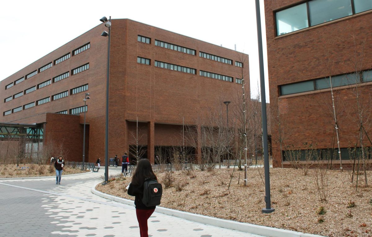
Wheatley and McCormack Hall—infamously and undoubtedly the two worst buildings on campus. Both were constructed in 1974, and seem to have been barely updated since then, judging by the outdated carpeting, labyrinthine architecture and school-gymnasium smell. However, the question remains: Which one is the absolute worst?
Of course, this is subjective, but how long would it take someone to go through every floor of each building and find a random room on each one? Obviously, there’s the dead-end hallways, inconsistent numbering and baffling layout to contend with at each, so naturally, it’s easy to get lost or turned around in either.
In the end, it took nearly 53 minutes to traverse all six upper floors of Wheatley. By contrast, it took only 23 minutes to find a random room on all five floors of McCormack.
Wheatley is not only taller than McCormack, but it’s more condensed, and that results in a lot of inconsistently laid-out rooms and what amounts to a loop. That means that more departments and offices are all squeezed into a tight space, and the result is more claustrophobic than McCormack. On the other hand, it’s also livelier—there seem to be more places for clubs and students to congregate, and plenty of tucked-away study spots.
None of that really makes up for how terrible it is to navigate. Each floor has a different pattern of hallways, different signage, and completely different construction, in the case of the Venture Development Center on the third floor. Many of the signs are home-made, sometimes just pen on a piece of office paper, informing people that they’re turned around. It’s also, unfortunately, the home to departments from nearly every college, and avoiding it is practically impossible.
McCormack’s design is much more open and spacious, and grouped into small batches, instead of lined up in one long circle around the entire building. Not only does that leave room for plenty of study space—and the gym, of course—it makes it much harder to get lost. No matter where you are, you have to try pretty hard to get lost. You can walk straight for a while and basically always end up at the central stairs.
The fourth and fifth floors are a different story, but still not nearly as confusing as Wheatley’s halls. Both are, for all intents and purposes, just a long hallway with conference rooms and offices on each side. Nothing much to it.
Of course, McCormack has its downsides. Some of the rooms have a distinct smell, to say the least, and the entire College of Management on the fifth floor seems sterile and devoid of personality. But that’s nothing compared to how hopelessly lost one can get on any given floor of Wheatley. Wheatley Hall is, without a doubt, worse than McCormack.
That’s not to ignore the serious issues of each building. Aside from the more superficial grievances, both Wheatley and McCormack have an accessibility problem; many of the doors are too heavy for disabled people who use mobility aids to comfortably open, if they can open them at all, and the layout is easy to poke fun at before you realize how difficult it is to navigate with impaired vision. At the end of the day, both buildings need a serious update for the health, safety and accessibility of their students—and while they’re at it, maybe the carpeting, too.


